MD设计中的应用结构App Structure in Material Design
对Material Design规范中App Structure一章的翻译:开始屏幕、顶级导航与组合导航的策略。A Chinese translation of the App Structure chapter from Material Design's Patterns section: start screens, top-level navigation, and combined navigation strategies.
本文是对Material Design Pattern部分中App structure章节的翻译,本文没有搬运相应的图片,请自行前往原页面围观图片(传送门)前言:应用结构你想要展示给你的用户的内容和任务影响着你应用的结构。比如说:
- 专注于一个单一的任务的结构(比如计算器或者游戏)
- 包含一个功能有限(对应下一条的深度导航)的导航栏的结构(比如带有通讯录功能的拨号软件)
- 包含复杂的数据浏览和深度导航的结构(比如一个带文件夹功能的邮箱应用)
本文内容包含
- 开始屏幕(不是欢迎页)策略
- 顶级导航栏(估计就是屏幕最上方的导航的意思?top-level)策略
- 结合性质的导航栏策略
开始屏幕开始屏幕是用户打开应用之后第一眼看见的玩意儿,所以它应该对新老用户都有用。用户体验的优化应该基于典型用户会做什么而展开。
- 把内容前置:让内容成为你开始屏幕的主要组成部分。把它弄得好看一点,把布局弄成响应式的
- 把导航和动作按钮固定:考虑使用APP BAR的方式展现导航控制,包括Tab切换和搜索啥的
- 专注于功能:把指向重要功能的导航弄得显眼一点,不太常用的功能弱化。使用扁平响应按钮前置你应用的主要内容
顶级导航设计策略把顶级导航用来介绍你APP最主要的功能。根据你自己的想法把它弄得简单或者弄得复杂。 关于嵌入式导航的一点想法简单结构的应用可以使用一个嵌入式导航去适配它的内容,然而这么做也会减少内容的可用显示空间 嵌入式导航的做法推荐给:
- 有强烈主要视图,替换内容比较少的应用
- 用来完成一些比较一致的任务的应用
- 使用量不大的应用
标签(TABS) 标签是用来在少量的同等重要的视图(view,也可以翻译成概念,意会)之间的。这玩意儿可以在浅层次结构APP或者APP功能不多的情况下增加顶级导航的存在感。标签会占据一个很显眼的位置,所以我们推荐使用相对较短的标签文字。 这个做法推荐给:
- 频繁切换视图的应用
- 顶级视图的数量不多的应用
- 需要轮番给不同的视图刷存在感的应用
在移动端的应用只有一层导航的应用,用顶部的文字标签就成了。撑死不能超过三到四个TAB,不然在小屏设备上用户就要滚来滚去(scrooling)才能切换他们想要的标签了。 在平板和桌面的应用用不太上,之后补上(目测会烂尾 侧边导航和抽屉导航想要一次性展示很多导航标签,你就得用侧边导航。这货可以关联也可以不关联抽屉导航。不过抽屉确实是一个用来从低等级的屏幕(比如新闻的内容)切换的很有效率的方法。而且这货一点都不烦人,你不按人家就不出现在屏幕上。只有一个主页的应用应该把最常用的路径导航列在抽屉的最上面,方便用户操作 这个做法推荐给:
- 有很多顶级视图的应用
- 需要在不相关的视图中快速切换的应用
- 深度导航结构的应用
- 不想让不常出现的页面刷存在感的应用
在移动端和平板的应用抽屉导航一般是关闭的,只有被选择的时候才会临时打开(意思就是选完就又收回去了(这不是废话么 在桌面设备的应用用不太上,之后补上(目测会烂尾 组合导航栏的策略 语境导航 (In-context navigation,其实应该是“点开之后是新一页的内容”的导航或者关联了内容的导航,不知道该怎么翻译) 当和tab以及抽屉导航一块儿使用时,语境导航允许用户在一组相关的数据(或者图片啥的)之间迅速移动。 用来:
- 给艺术家关联歌曲
- 在最近项目和历史记录里头转移
- 把用户的投稿(post)关联到他们的资料页面
向上箭头用来回到之前的层级 结合标签的边侧导航有两个层级的导航可以用边侧导航和标签结合的方式来进行一个展现 图例: 左边这货就是In-context navigation,右边图左上方就是..向上按钮( up arrow )
This post is a translation of the App structure chapter in the Patterns section of Material Design. It doesn’t carry over the corresponding images, so please head over to the original page to gawk at them yourself (portal)Foreword: app structureThe content and tasks you want to show your users shape your app’s structure. For example:
- A structure focused on a single task (a calculator or a game, say)
- A structure containing a navigation bar with limited functions (as opposed to the deep navigation of the next item) (a dialer app with contacts, say)
- A structure containing complex data browsing and deep navigation (an email app with folders, say)
This post covers
- Start screen (not the welcome page) strategies
- Top-level navigation bar (presumably the navigation at the very top of the screen? top-level) strategies
- Combined-style navigation bar strategies
Start screenThe start screen is the first thing users lay eyes on after opening the app, so it should be useful to new and old users alike. UX optimization should unfold around what a typical user would do.
- Put content up front: make content the main component of your start screen. Make it look nice, and make the layout responsive
- Pin the navigation and action buttons: consider using the APP BAR approach to present navigation controls, including Tab switching, search, and the like
- Focus on functionality: make the navigation pointing to important functions more prominent, and play down the less-used ones. Use flat responsive buttons to bring your app’s main content forward
Top-level navigation design strategiesUse top-level navigation to introduce your APP’s most essential functions. Make it simple or make it complicated, as you see fit. A few thoughts on embedded navigationAn app with a simple structure can use an embedded navigation to fit its content, though doing so also cuts into the display space available for content The embedded navigation approach is recommended for:
- Apps with a strong primary view and little content swapping
- Apps used to complete fairly consistent tasks
- Apps that don’t see heavy use
Tabs (TABS) Tabs are meant for use between a small number of equally important views (view, which you could also translate as concept; take the gist). This thing can boost top-level navigation’s presence in an APP with a shallow hierarchy or one without many functions. Tabs occupy a very prominent position, so we recommend keeping tab text relatively short. This approach is recommended for:
- Apps that switch views frequently
- Apps with a small number of top-level views
- Apps that need to push different views into the spotlight in turn
Use on mobileFor apps with only one level of navigation, text tabs at the top will do. Three or four TABs at the absolute most, or else on small-screen devices users will have to scroll back and forth (scrooling) to switch to the tab they want. Use on tablets and desktopNot much use for it; to be filled in later (I suspect this will be left unfinished Side navigation and drawer navigationIf you want to display a lot of navigation labels at once, you’ll have to use side navigation. This thing may or may not be paired with a navigation drawer. The drawer, though, really is an efficient way to switch away from lower-level screens (the body of a news story, say). And it isn’t the least bit annoying: it doesn’t show up on screen unless you press it. Apps with only one home page should list the most frequently used navigation paths at the very top of the drawer, for the user’s convenience This approach is recommended for:
- Apps with many top-level views
- Apps that need to jump quickly between unrelated views
- Apps with deep navigation structures
- Apps that don’t want rarely visited pages hogging the spotlight
Use on mobile and tabletsThe navigation drawer is normally closed, and only opens temporarily when selected (meaning once you’ve picked, it tucks itself back away (as if that needed saying Use on desktop devicesNot much use for it; to be filled in later (I suspect this will be left unfinished Combined navigation bar strategies In-context navigation (In-context navigation; it really ought to mean navigation where “what you tap opens as a new page of content,” or navigation linked to content. I don’t know how to translate it) When used together with tabs and drawer navigation, in-context navigation lets users move quickly within a set of related data (or images and such). Used for:
- Linking songs to an artist
- Moving around between recent items and history
- Linking a user’s submissions (post) to their profile page
The up arrow is used to return to the previous level Side navigation combined with tabsNavigation with two levels can be presented by combining side navigation with tabs Illustration: The one on the left is In-context navigation, and at the top left of the right image is.. the up button ( up arrow )
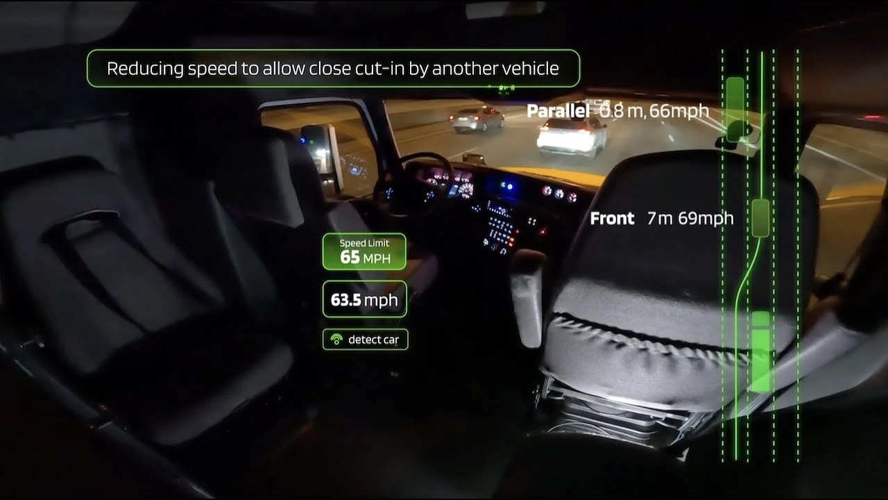
构建快速的产品问题解决迭代Forming Fast Product Problem-solving Iterations
在 TuSimple 构建快速的产品问题解决迭代:对齐上下文,最大化参与决策,快速实验,管理预期。Forming fast product problem-solving iterations at TuSimple: shared context, maximized participation in decision-making, quick experiments, and expectation management.

颠覆性技术公司用户研究入门Disruptive Technology Company User Research 101
在图森未来时写给团队初级设计师的一份用户研究入门。A user research primer written for the junior designers on my team at TuSimple.
产品讨论Product Discussions
一篇关于如何开产品讨论会的笔记:区分事实判断与价值判断,想清楚哪些讨论值得花时间。Notes on how to run product discussions: separating factual judgments from value judgments and deciding which debates are worth the time.
Comments